This is a sponsored article.
No matter what you sell, how you present your store layout is a crucial part of your business’ ability to attain greater sales and profitability. Optimised store layouts help drive sales and improve the customer experience, while inadequate layouts leave customers confused and perhaps even agitated. The reasons why you shouldn’t overlook the importance of proper store layout, whether you’re a small or big business, are quite clear, but optimising all aspects of it is a common challenge.
In this article, you will learn a few essential tips for optimising your store layout to help your drive sales and achieve greater customer satisfaction.
Getting a hold of the overall store design
The purpose of your store is to naturally present all your available products to the customers and provide them with the opportunity to purchase the items. But how you present your products isn’t entirely inconsequential.
Especially as a small business, you want to utilise the space to the fullest and stock as many products as possible to generate sales and growth. But at the same time, you don’t want the store to feel too cluttered and confusing for the customer. On the other hand, larger stores should not look empty, even if the core product offering isn’t too expansive. That’s where the skill of store design comes into play.
Optimise towards a streamlined customer flow
One key discipline regarding store layout optimisation concerns customer flow, which is about adapting the layout to fit the right amount of people inside and preventing eventual bottlenecks from occurring. Customer flow plays a big part in the customer experience and can easily be a deciding factor in a good versus bad experience.
It can be as simple as having the right signs in the right places to help the customer navigate the store’s various offerings as well as important touch points such as check out or dressing rooms. But more importantly, customer flow optimisation is about preventing long and inconveniently located customer lines which can easily create a lot of irritation.
Store areas with plenty or little traffic should both be dealt with accordingly to avoid customer irritation and improve product turnover respectively. Each area should be monitored closely to discover potential improvements.
Make sure that the layout fits the available space
Store layout optimisation presents plenty of different ways to present the specific layout. Not every type of layout fits every store, so choose wisely. These are some of the typical store layouts:
- Forced paths – With a forced path, you can fully direct the store experience and make sure that the customers see all your offerings. The downside is that the road to the checkout isn’t a quick one to go through.
- Grid – Grid layouts are the most popular used store layout. It is great at creating equal attention to and displaying all available products. The drawbacks are that they mostly suit larger spaces, and you can’t quite create a focused customer experience.
- Loop – Loop-style layouts are all about deliberately leading customers around the store to showcase your entire product range before they end up at the checkout. The general product exposure is maximised, and the customer flow is streamlined. The downside is that if your store has a lot of customers at the same time, it might be more difficult for each individual to be able to browse the products.
- Free-flow – Free-flow layouts are looser in the way that they guide customer flow and how each aisle is presented. Generally, the layout tends to combine various other store layouts to fit the store’s purpose. It can work quite well for smaller places but requires a lot of trial and error to find the optimal layout.
Regardless of your choice, remember that the general aim is to create maximum product exposure and ensure that customer flow is as streamlined as possible.
Don’t overlook the importance of shelf space optimisation
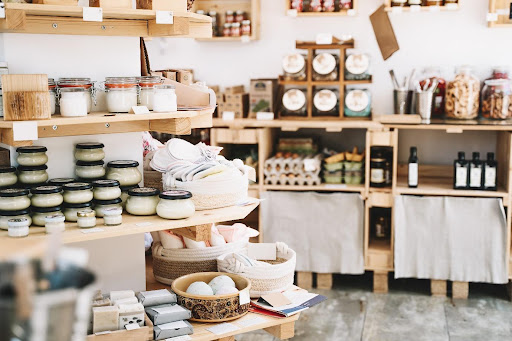
Optimising your store to drive sales also requires you to look further into where and how each product is placed and presented on each shelf. Your customers should be able to easily find your most popular and best-selling products – also your newest or promotional product that you want to push.
Usually, you want to place these items at eye height and at the front of the store to create a great first impression. An eye-catching display will also help direct attention to the products. Alternatively, you can place popular products at the back of the store to increase the overall product exposure to each customer.
The implications of layout optimisation for businesses
How the space layout is planned in both the business and industrial sectors can make a significant difference. At warehouses, the layout needs to support minimal picking time and the maximum number of handled orders per employee or per hour. Plus, the warehouse layout should fit the overall storage strategy, whether you follow the first-in-first-out or last-in-first-out approach.
For stores, layout optimisation has the implication of enhancing product turnover, making the best use of the available space, and presenting a shopping environment that aligns with your brand’s image and attracts your target audience.

